Changelog
See what's new with Whippy.
Fixed: Missing Sample Warnings for Mapped Workflow Fields
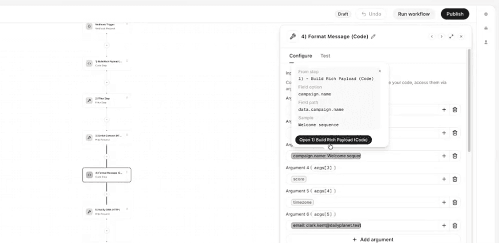
Workflow fields now show a clear warning when the mapped data isn't available in the upstream sample, replacing silent, hard-to-diagnose mapping failures with actionable, in-context guidance.
What's included

Missing sample warnings: A mapped field displays a warning when the selected field is missing from the current upstream sample, the upstream step has no sample captured yet, or the referenced step no longer exists in the workflow.
Actionable popover: Clicking or hovering the warning opens a popover that identifies exactly what's missing and which step is causing it.
Direct step navigation: From the popover, users can jump straight to the upstream step and select or capture a new sample that includes the required field, without leaving the current view.
Healthy mapped fields also get a hover popover with the sample value, field path, and a link to the source step.
How it works
Previously, a mapped field could appear correctly configured in the workflow builder even when its underlying data wasn't present in the upstream sample. This made it look like a field mapping error when the real issue was missing sample data, and troubleshooting meant manually checking each upstream step.
Now, Whippy workflows detect this mismatch automatically. When a mapped field's data isn't in the current sample, the field flags a warning instead of failing silently. Clicking into the warning shows the specific cause (missing field, no sample, or a broken step reference) and links directly to the step that needs attention, so the fix is one click away.
Why it matters
- Removes ambiguity: Users can immediately tell whether a workflow issue is a sample data problem or an actual field mapping error, cutting down on unnecessary debugging.
- Speeds up troubleshooting: Instead of manually reviewing each step in a workflow to find the source of a broken preview, users go directly to the step that needs an updated sample.
- Improves workflow reliability: Catching missing sample data early prevents downstream issues in automations and integrations built on those mapped fields.
Notes
Existing workflows are covered automatically by this update. No reconfiguration is required for warnings to start appearing on affected mapped fields.
Changed: Cleaner Interface Design Across the Whippy Dashboard
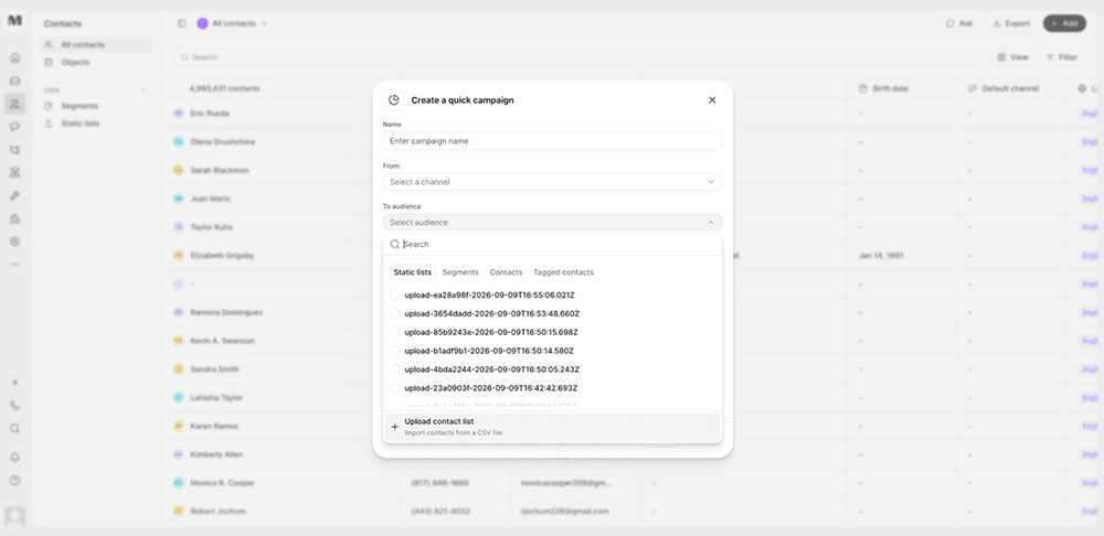
We improved the visual consistency and interaction quality of the Whippy dashboard, making everyday surfaces feel tighter, clearer, and more unified across light and dark mode.
What's included
- Core layout components: Page layouts, sidebars, tables, drawers, dialogs, pickers, and tabs now share consistent spacing, borders, and structure.
- Composer tools: Message templates, signatures, and audience pickers got clearer browse and select flows, reducing time spent hunting through cluttered menus.
- Cross-app consistency: Lists, Settings, Sequences, Workflows, Contacts, and Home now use the same visual language for spacing, borders, and hover states.
- Interaction details: Search fields, date pickers, empty states, and overlays received small refinements that make them feel more finished in both light and dark mode.
How it works
These changes apply automatically across the dashboard. No configuration or setup is required. Existing workflows, saved views, and automations continue to function exactly as before. Only the visual presentation and interaction feel changed.
Why it matters
A consistent design system reduces friction in daily use. When every screen follows the same visual rules, common actions like composing a message or picking an audience become faster and more predictable, since users aren't relearning patterns from screen to screen.
This update also sets a foundation for future releases. New features built on Whippy's design system can reuse these same components, which means faster delivery and fewer inconsistencies as the product grows.
Notes
This is a visual and interaction update only. No underlying data, permissions, or integrations were changed.
Added: Speak During Execution Setting for Agent Knowledge Bases

Voice Agents can now speak while searching a knowledge base instead of leaving callers in silence during longer lookups.
What's included
A new "Speak during execution" toggle on the Knowledge Base page in the Agent editor
The setting can be configured before or after attaching a knowledge base to an Agent
Two speech modes: speak while searching, or search first and speak once results are ready
How it works
Open the Agent editor and go to the Knowledge base page. Turn on "Speak during execution" to have the Agent speak while it searches. Leave it off and the Agent will search the knowledge base first, then speak once it has an answer. The setting applies per Agent, so different Agents can use different behavior depending on their use case.
Why it matters
Knowledge base search time varies with the size of the knowledge base, and larger knowledge bases take longer to search. Without this setting, callers had no indication the Agent was still working during longer searches, which could read as dead air or a dropped call. This setting gives customers control over the call experience: Agents handling large knowledge bases can speak during the search to reassure callers, while Agents with fast lookups can keep the search-then-speak flow.
Setup
- Open the Agent editor for the Agent you want to update.
- Go to the Knowledge base page.
- Toggle "Speak during execution" on or off.
- Save the Agent.
No knowledge base needs to be attached first. The setting can be turned on or off at any time, before or after a knowledge base is added.
Notes
By default, "Speak during execution" is off. Agents search the knowledge base first and speak after the search completes unless this setting is turned on.
Added: Funnel Charts Can Follow the Same Contacts
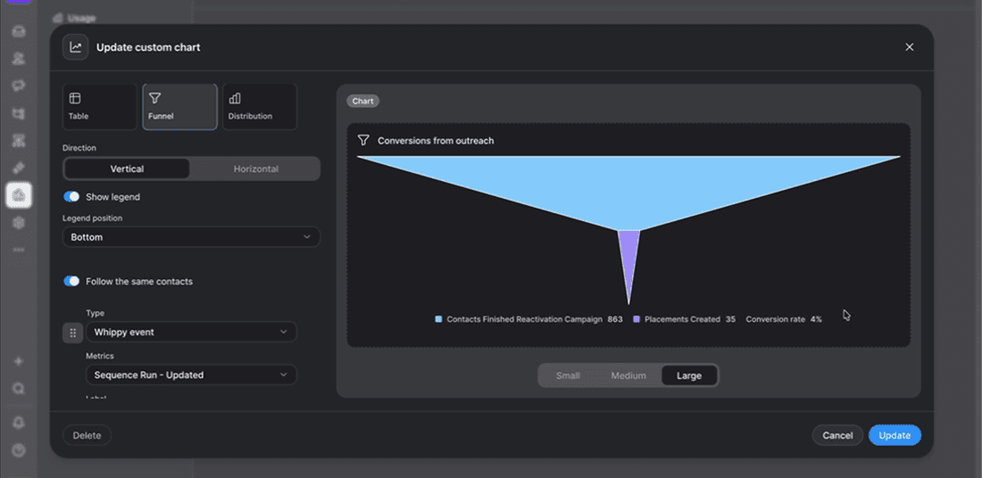
Funnel charts in custom reports can now follow the same contacts from stage to stage, showing step-to-step percentages and an overall conversion rate when enabled.
What's included
- Follow the same contacts toggle: A new toggle in the funnel chart builder links each stage to the one before it, so every step reflects contacts who actually came from the previous stage. Off by default.
- Unique contact counting: When enabled, each stage counts unique contacts, even if a contact went through a sequence or generated a result more than once.
- Step-to-step percentages and conversion rate: With the toggle on, each stage shows what percentage of the previous stage reached it, and the legend displays a first-to-last stage conversion rate.
How it works
Turn on "Follow the same contacts" in the funnel chart builder to connect each stage to the one before it. Once enabled, each stage counts only unique contacts carried over from the previous stage, so the funnel never grows between stages, and percentages calculate automatically.
Why it matters
By default, funnel stages show unrelated counts with no connection to each other, which still works for some use cases. But when the toggle is on, conversion rate between stages become visible without manual calculation, and the funnel reflects how contacts actually move through a sequence or process.
Notes
- Off by default. Existing saved funnel charts are unchanged unless the toggle is switched on.
- Percentages and conversion rate only appear when this toggle is on, since disconnected stages would produce misleading percentages.
- Applies to funnel charts in custom reports only, not campaign goal funnels.